Sun Moon Surfboards
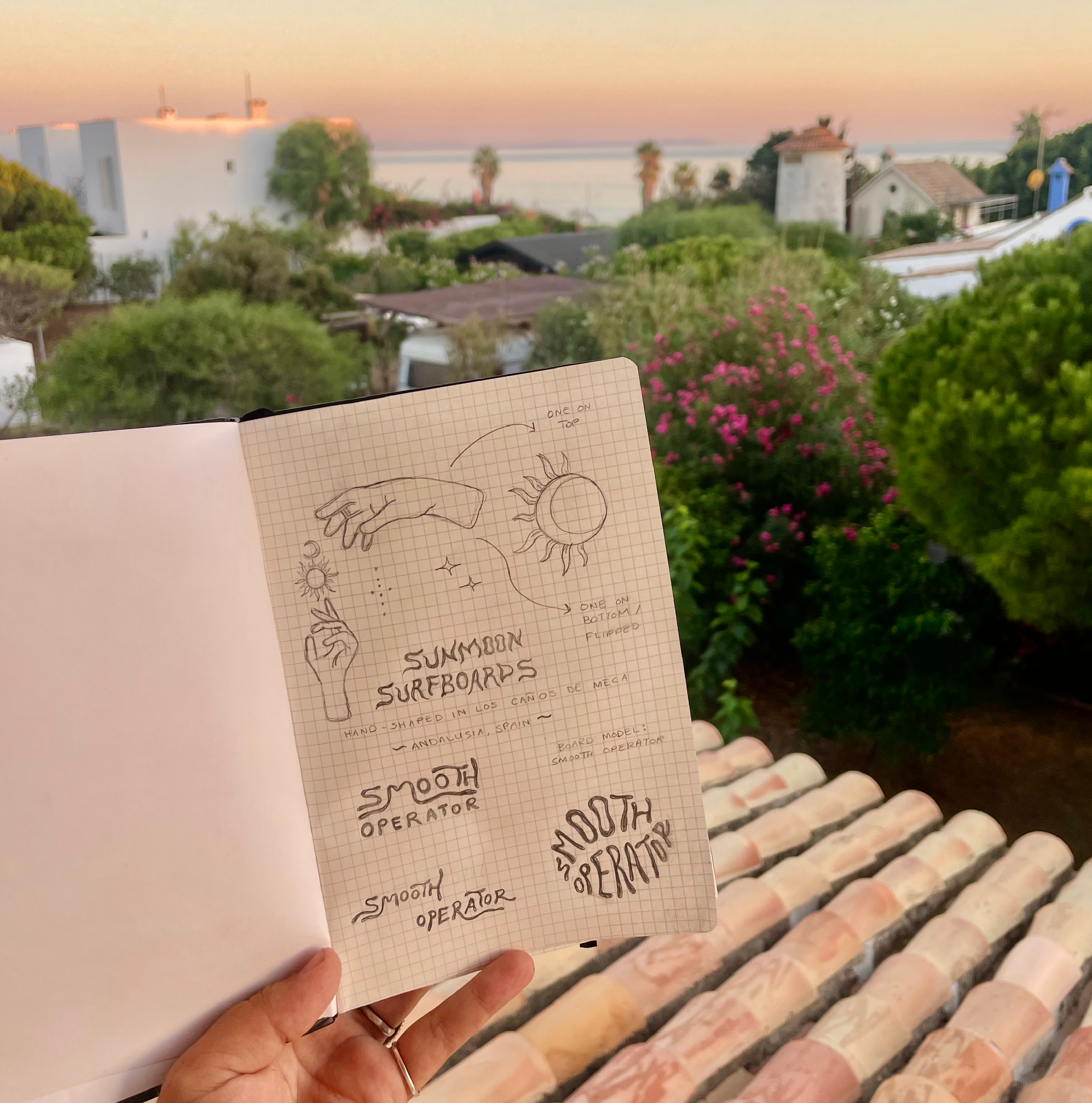
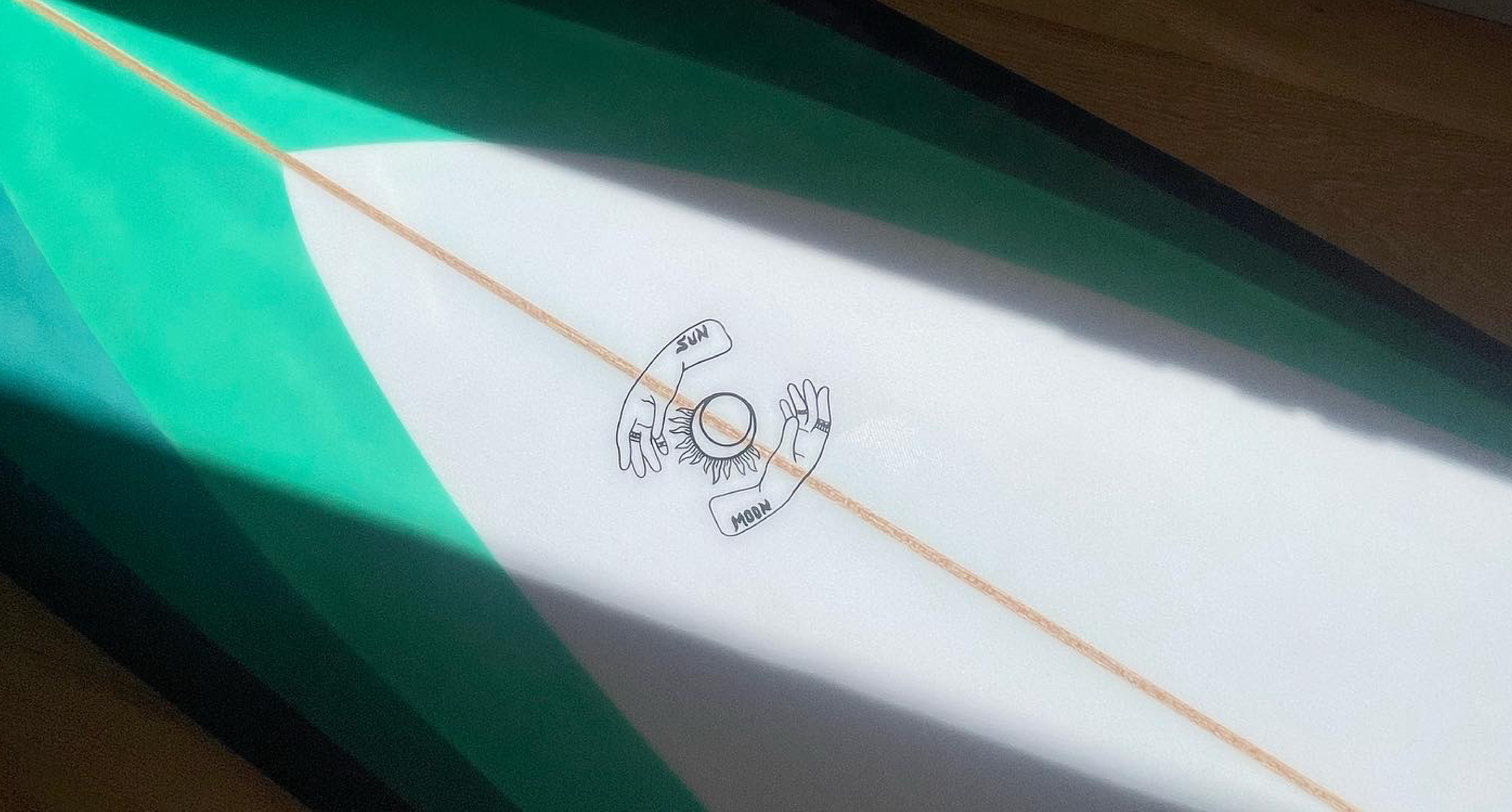
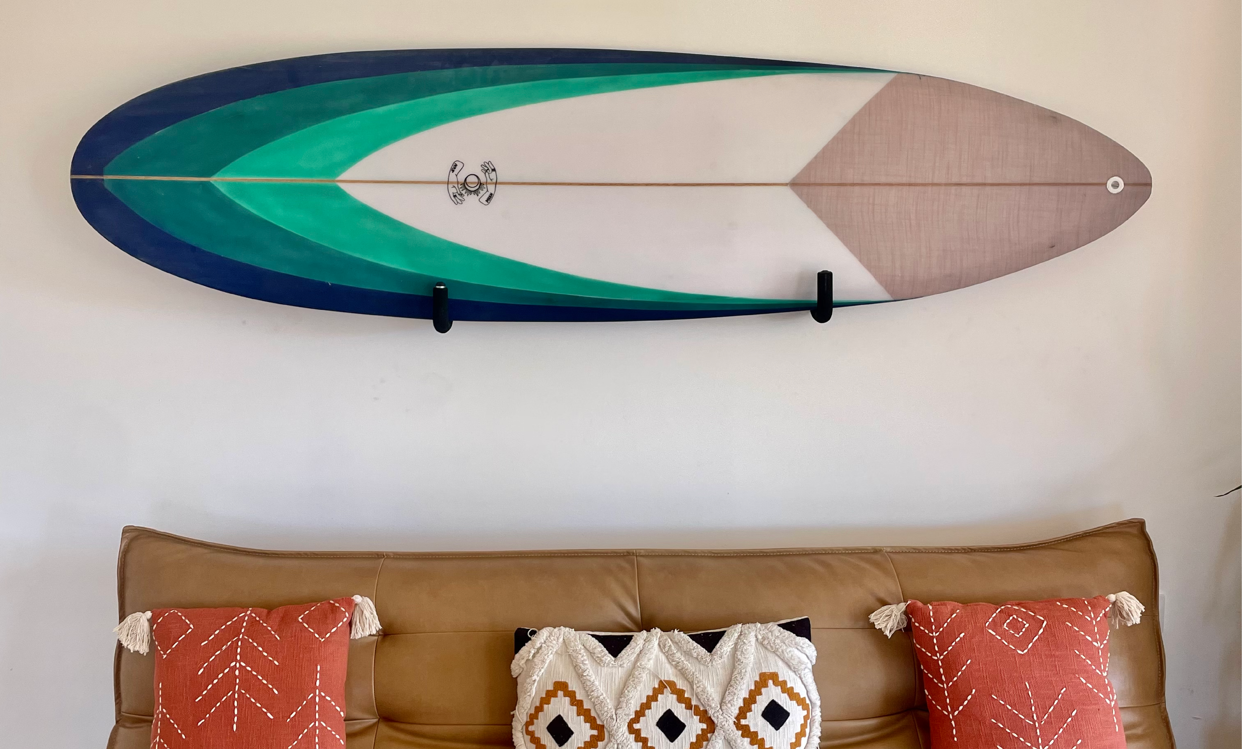
The logo for Sun Moon Surfboards reflects the artisanal, hand-crafted spirit of the brand, inspired by the natural beauty of Los Caños de Meca, where they are hand shaped in an old camper. Featuring a hand-drawn design, the logo intertwines the celestial symbols of the sun and moon, representing the harmony between nature, surf, and the craftsmanship of each board. The fluid lines and imperfect curves evoke the personal touch of a shaper’s hands, celebrating the unique, one-of-a-kind boards created in this small surf village in Spain.
The logo for Smooth Operator is sleek and effortless, mirroring the smooth glide and precision of the surfboard model that it represents.
During my time in Spain, each logo and model logo was hand drawn onto the boards after glassing. Now, the logos are printed and glassed into the board.


